VINYL KILLERS 2018

Super Happy about this folks!  I got the call to put records in the freshly revived VINYL KILLERS show, like, 5 days before the deadline!  OF COURSE i want to be part of it, BUT i don’t have anything!  Well, 3 days later I’ve got 5 records for show, just about the fastest I’ve ever produced anything like this!  YEEEEE!!!  OF COURSE i can point out every little flaw, but damn, I’m pretty happy with these!  I owe it all to my large stacks of material, kept like a hoarder, a free weekend (that was about as beautiful-fall-in-pdx as you can get), and PERSISTANCE (that sax player is the third iteration of him).

poster-vk-all-1

VINYL KILLERS AT THE GOODFOOT

Analog Postcards

Image

postcard 1 shows what it protectspostcard 2 i want to smoke potpostcard 3 a message from the mediumpostcard 4 we hear a song to forget


These are “analog”, i.e. all cut’n paste, no photoshop (save for putting them into the computer and the tag).  Also, no other media, all made with the actual source media (no copies of original or modification of media, save for the cutting and gluing down.)  made over 3 days.

The BIG 500 of 2016


well gang, here we are again, at yet another BIG 500.  Now that isn’t a bad thing.  Most people I know would be surprised to find out that I make stuff –art, if you want to call it that–and that’s  my fault.  Part of that is that is I’ve got no game, no business savvy, no promotion, zip, nada, zilch –I don’t even really talk about it.    The other big part is that I just don’t make a lot of art in a year’s time, so when you put that together, my website is just one “88 STRONG” after another “BIG 500” for the most part.  I get it.  There’s many reasons why this is — none that are great, and none really your business (unless you feel like being my patron, then we can go into details, because someone’s support would be crazy great.  Do patrons even exist?)

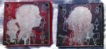
I’m going to chat for a minute about this years set for the BIG 500.  This all started out over the summer when a friend of mine was making panels that correspond to the Chakra colors.  I don’t subscribe to the Chakra thing, but seeing panels of bright primary colors rekindled an interest in making colorful abstract pieces.  I dig color theory and abstraction, yet most of my work usually centers around a found image that would be collaged, a story would be created, and while color would play a role, it was the supporting cast.

Color and Pattern can be the story.

Pattern makes me think of quilts, which makes me miss my gramma.  My family isn’t that artsy, so I take note when I hear how my retired dad tinkers in his basement-woodshop making birdhouses, and I encourage mom to sell those Afghans she crochets, and “Like” on FB everything beautiful my distant relative Jan Christensen creates (an amazing photographer), but when I was a kid, the only artsy thing I saw from my family was my gramma’s quilts.  The whole dining room would be taken up with the table-stretcher contraption, so you couldn’t hide it.   Quilting sure as hell didn’t look like it could just be a hobby or something to do when you were bored and cold (my mom’s reply to why she crochets for free), although I bet gramma didn’t make a dime off it either .  Serious craftsmanship and time is put into making good quilts. Taking fragments of colored patterned cloth, cutting them to shape, making whole new patterns.  It’s a beautiful art.  I’ve thought it would be great to learn, but i don’t have the slightest where to start, and I’m sure I don’t have the time or dedication needed.

Around the same time as all the color thoughts were bubbling, I ran across a basic quilting pattern book at the bins.  Now, as of late, I’ve been all about the Gel Medium Transfer technique,  with my newer works building in layers, where one transferred layer sat on/over/through another.  I was inspired –I used one of the patterns, a basic “Columbia Star” pattern, as my drop-in point.  Color, pattern, and a shape, the basic cube, that’s the beginning.  The next part was about slinging paint.

I’d throw paint down,  frisket the panel, cut out my pattern, maybe throw more paint down, maybe gel medium a layer of texture down, and then pull that frisket off, put more down and kept continuing the process.  Then there are a few pieces here which have  no paint-slinging involved, they are strictly just transferred images on top of other transferred images.

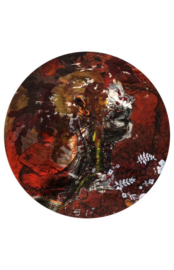
What I found fun was the de-evolution of the pattern.  Some I kept tight, didn’t let those shapes float around, others i tried dealing with creating some kind of depth, some I broke apart, and there are two (one is pictured) where I got away from the pattern altogether, though I feel the physically-tiled piece still identifies with the other.

I named these pieces “PROBLEM AREAS”, as I took this as a challenge to create with color/pattern/shape, along with the usual challenges I encounter in art-creation, but also as a nod to a musician I had been listening to practically throughout the entire time I made these.  ONEOHTRIX POINT NEVER

Side note:  here’s what gets me–after about 3/4 through this series, I’m down at the bins (again) and find a book on some quilting artists and I am thoroughly humbled.   I am in complete awe of Jan Myers-Newbury.  It’s as if she had a similar kind of idea process with color, pattern, and evolving/de-evolving in her quilting, (i believe she does say something about starting out with the basic square) and has become some zen-master of it.

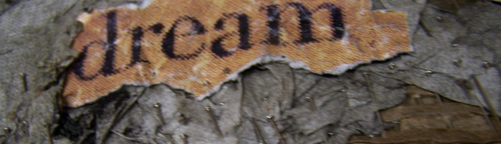
If I were to keep going down my path with what I have in these few pieces, I could only dream to have them looking anywhere near as beautiful as hers.  Click and you’ll see.

I am in complete awe of Jan Myers-Newbury .


the 88 STRONG of ’16

Another year, another go at the 88 STRONG show.  As usual, artists receive up to eight 8″x8″ wood panels to create art on, working off of 88 possible themes.  This year I started off with throwing lots of color down, without any idea where it’d take me.  Some of it worked, some of it didn’t, but luckily I have plenty of this size panel to work with –finished 8, probably have about 12 that I was working with.  Bought a big ol’ roll of pallet tape which works great as frisket paper.  Recent work involves use of color, shapes, and layering of gel medium transfers.

Walking from time, to you

L.CHRISTENSEN_from time to you

walking from time to you

So terrible at putting up new stuff, sorry, This got done back in January.  This piece is kinda a triumph for me, process-wise, as it started out throwing paint on an already wallpapered panel.

It told me what it was looking for, and, once images were found and manipulated, it got done.  Yeah, so what, that’s what supposed to happen, right?  Yes, yes it is, but that’s the thing. the “gettin” part.  See, the piece said, “you need just this type of head”, and that was easy enough –2 grey’s images, reworked together.   But then, what’s it needing?  Pull up some of that flower wallpaper out of the splatter paint, see some flow, some movement, start thinking a lot on composition, and wait for it.  take some older halftone work and work it in, like waters, it shoulder deep.  Still all waiting for the image to start bringing things in, focus my search to colors, making this picture RED.  Success at the bins, finding an old 70’s coloring book, providing me with subjects, background, a “place” for that head to sink into.  Then it’s push and pull, selecting what stays and goes, and making a great decision for my head’s “hair”  –because of the original splatter paint working with the head, I always saw the head as a her, with flaming hair.  The piece had really grown away from that, like it started as “you could be mine” by G’n’R, but was turning more into “november rain”, if you catch my drift.  The work, by then, with all the red, and images of trees and foilage, was screaming fall leaves, which were a plenty.  Once I resolved the lower portion from the previous decision of halftone dots (which is kinda it’s weak point) with the laying flat face, it was done.

fireflowerwalk before nancy drewRED

–an “in progress” pic of the same piece.–

–and yes, for you observant folks, that “red tree background” in the finished piece is used (albeit more manipulated) in the “zoey” plate of previous blog-post.  With the finishing of this, and the sucess at the zoey piece, I will sometime make a plate with this image on it, that is, once I find the plate for it.–

from time to you plate

–something like that.


Zoey’s Journey

Image


well, that didn’t take long.  finished.  actually, the plate I’ve had prepped and waiting for an image for at least 3 years.  THIS is why they’ll find me in a hoarder-house someday.  Mind you, it’ll be hoarded full of artsy-farts material waiting to be ‘podged together.

Anyways, this is a plate with a gel-medium transferred image.  The image is three images cobbled together via photoshop.


The Big 500 of 2015

medium transfer

medium transfer

paint/screenprint on epoxied panel

paint/screenprint on epoxied panel

transfer/screenprint on collage

transfer/screenprint on collage

gel medium over collage transfer

gel medium over collage transfer

paint with gel medium glitter print

paint with gel medium glitter print

Doesn’t look like much has gone on for like….a year?  Well, nope.  Stuff has gone on.  “stuff”, like, say a total of 10+ new pieces that aren’t up on the site.  That’s just silly of me.  Been really working on developing a printing-style process of creating collage using gel-medium transfer techniques.  But then I go and throw paint down, then I go and see something in it, then I have to go and chase that for a while.  Not a lot of work this year, but the process behind the work has been generous.

If you don’t know about gel medium transfers, well, there’s like a million different ways and means, and I have definitely got some opinions on the matter, but here.  This link is a pretty decent start.  I’ll have to make a tutorial sometime…

The Big 500 of 2014


Well, it’s that time again, time again for annual “BIG” show.  It’s actually called THE BIG 500 this year, as every year seems to grow about 100 more.  I’ve discussed this before (just check, look for the tags, or scroll back a ways, it’s not really that far)  –premise is this:  500 artists (it started years ago at 100; its now listed at 500, though I know it’s more like 600 actually participating) get up to 10 (8″x8″) wood panels and approx. 2 months to create whatever art they want, in whatever mediums they want.  These are then shown all together, randomly and are sold for $40 each, cash and carry.  Most of the money goes to the artist, with the remaining going partly to the gallery and partly to Oregon Food Bank.  They also ask that those coming to the show bring a can of food for the Food Bank —

It’s pretty much a win-win for everyone involved.  Artists make some money if their work sells, but even if it doesn’t, its at least been viewed by a very large audience.  The gallery makes very little when the costs are factored in (imagine the cost of all that wood that is bought and cut) but the amount of people being exposed to Peoples Gallery (as well as the 3 other galleries participating:  Mark Woolley Gallery, the Artist In Residence, or A.I.R. Gallery, and the Rotator Gallery) is well worth it.  And while the OR Food Bank doesn’t get much out of one sale, or one person showing up with a can of food, when you multiply those sales by (possibly, if all sold, though I think it’s more than half) 5000, and the opening crowd being over 200 people strong, they do pretty good.

What I enjoy about THE BIG 500 (in no particular order):

The EXPOSURE!  Your artwork gets to be seen (and bought) by HUNDREDS of people, on the FIRST day it’s up!  And because it’s during the Christmas Season, your chances of selling is good!

The PRICE!  Now, I’m a very poor person (i think i’ve got $14 in my bank account right now) but even I can (usually) afford $40 for a unique piece of art.  There’s a group of collectors who LOVE this show, because they know their favorite artists have up to 10 pieces selling dirt cheap.  It’s true, with some of these artists, its a rarity to get their art at $40.

The CHALLENGE!  I’m sure some artists can just crap out masterpieces (bully for them) but for many I know, it’s a challenge to make 10 works of art in 2 months –And that’s OK.  Challenge Accepted!!!  I  find it usually works something like this:  I immediately have ideas for about half, then when crunchtime really gets me, I come up with the rest and more to spare.   They ask that we do “good work, work that people know us by, work that sells”  —and while I don’t disagree with that, I don’t feel like I have “work that people know me by”, and since most of my stuff doesn’t sell (sad) it’s hard to stop myself from making something just because it might not sell.  What I enjoy in the challenge is that in the process I learn so much.  This year I got a lot of practical experience cutting glass, as 7 out of 10 pieces use glass.  One piece in particular I had to remake 3 times because of breaking glass (also the reason for 9 pictures rather than 10).  I also learned a few things about the epoxy I use which could definitely help out in future projects.

The VOLUNTEERING!  It gets SO CRAZY on opening day, but at the same time its SO CRAZY FUN!

The ART!!!  If you don’t look at art all year, this event will take care of all your art-looking needs.  Simple math says that there will be (at least) 5 FRICKIN THOUSAND pieces of art to look at!  You just gotta do it quick, cause by the end of the first day (my guess is that) nearly half of it will disappear.  Even if you don’t show up the first day, there will still be THOUSANDS of quality pieces to buy for the remainder of the show.

that all said–


You should Go!

The Annual BIG 500

Opening 2pm Saturday, Decemeber 13th thru January 11th

at THE PEOPLE’S ART OF PORTLAND GALLERY

in the Pioneer Place Mall, 700 SW 5th Ave, suite 4005

www.peoplesartofportland.com

Vanity B. Ramsey

vanity b ramsey 
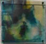
So this is something that’s been sitting around, half done, for —let’s just say 2 years.  It’s probably more than that.  At the time when  I made the image itself I was experimenting with CMYK images –how to break an image down in photoshop into the 4 channels and prepare them for eventual screenprinting.  I was also then dabbling with image transfer techniques –I also had a lot of film (transparency film for burning screens, which I had quit using since I had gone to the veg. oil and photocopy technique of making films) and a lot of glass (cuz I was framing a lot of artwork).  I had other interpretations of this image, just nothing that really worked so far.  So it was in the spirit of “lets just see what happens” that I made this verson.  There are two films sandwiched together on top of glass.  One film is the Magenta and Black channels, which depict an old (and common) image of Death, coming out of the grave.  The other film, done in the yellow and cyan, depict a common image of Jon Benet Ramsey in full child beauty queen regalia.  Those who don’t know who she is, look her up.  I’ll let you come up with your own interpretation of why the two have been combined, though I think it’s obvious.  Anyways, after putting the glass together and putting it into a frame, I put it away until just this month.  I think it was more about trying out something than coming up with a finished piece, and when i got to that point I guess I was stumped.  Without it being in a window, or some light source behind it, it was too dark.  So it got put away and forgotten about, mostly.

This coming month there is a group show that I thought this would be perfect for, so I got it back down and thought about how to make it work better.  2 weeks thinking of “how do I create a lightbox that’ll work, look decent, but still be temporary in case the viewer/owner wants to put it into a window”.  Then I said, this thinking isn’t getting me anywhere, lets just build it and figure it out as I go.  This is the result.  The light box is made up of scrap wood, a piece of semi-opaque acrylic, and a 26 ft. string of LED lights woven behind the acrylic, powered by batteries.  The LEDs run cool enough to where they won’t cause any problems with the glass or plastic films, the battery pack solves any problem I would’ve had with wiring, and is cheaper and as effective as flourescent lighting.  The simple box framing is held onto the frame by  4 screws, so it’s easy to take apart and hang without the lightbox, though now I’m a big fan of the lightbox, which had been put together in under a day.  Part of me says “why didn’t you do this sooner?”, but most of me says “Good work Larry –Good work and in due time.”