Walking from time, to you

L.CHRISTENSEN_from time to you

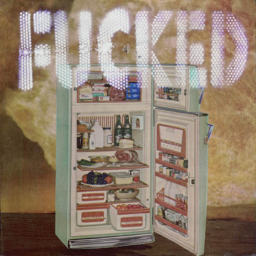
walking from time to you

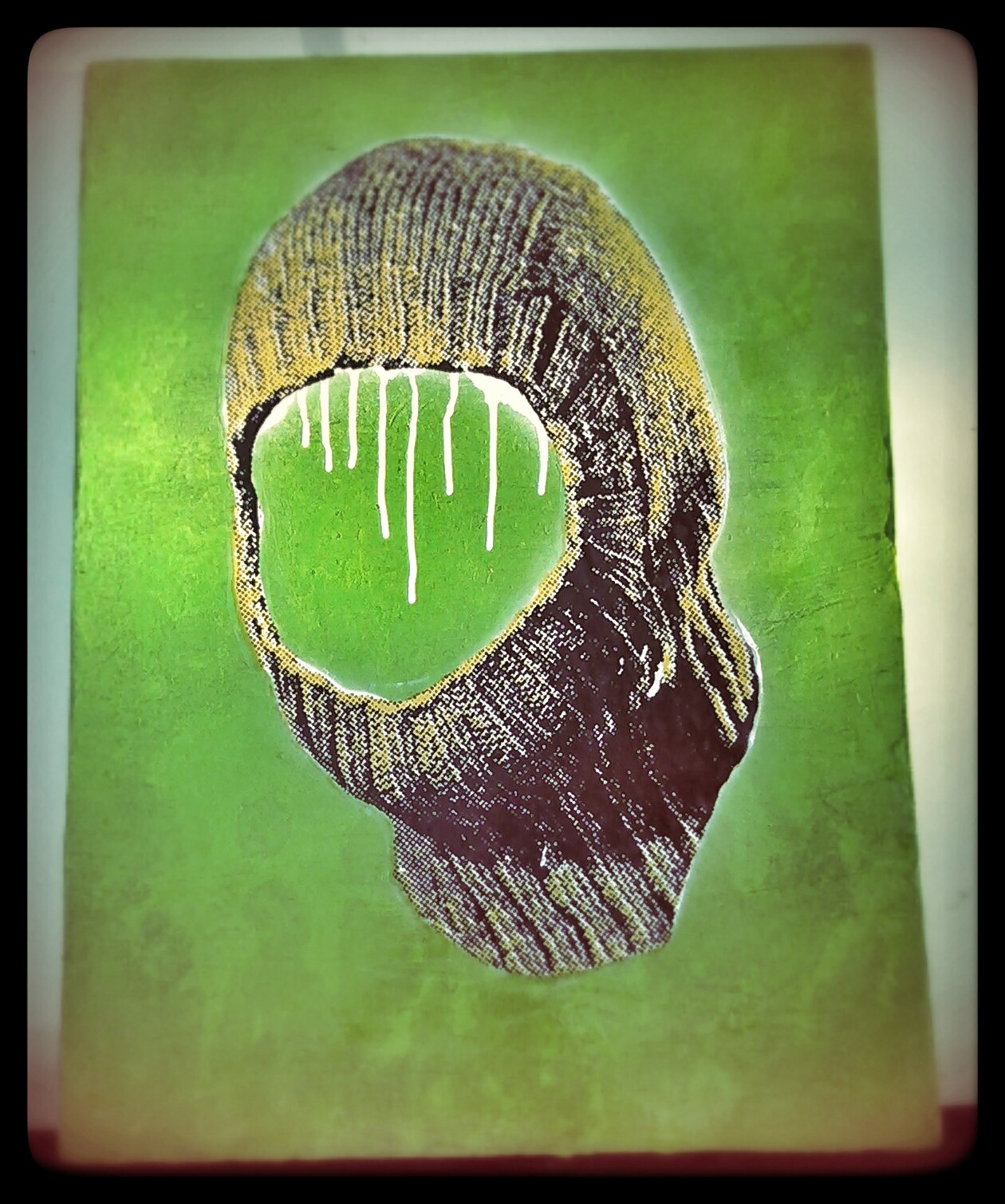
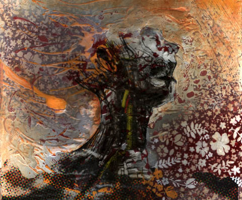
So terrible at putting up new stuff, sorry, This got done back in January.  This piece is kinda a triumph for me, process-wise, as it started out throwing paint on an already wallpapered panel.

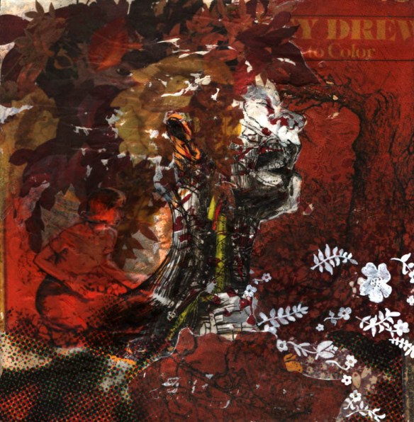
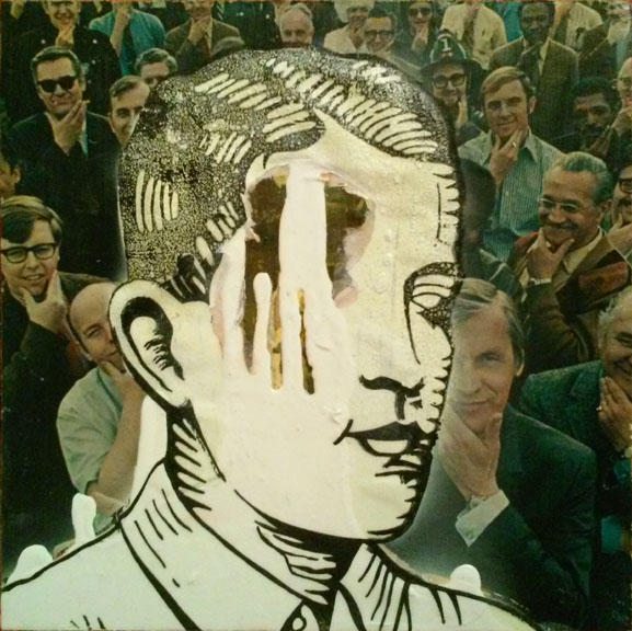
It told me what it was looking for, and, once images were found and manipulated, it got done.  Yeah, so what, that’s what supposed to happen, right?  Yes, yes it is, but that’s the thing. the “gettin” part.  See, the piece said, “you need just this type of head”, and that was easy enough –2 grey’s images, reworked together.   But then, what’s it needing?  Pull up some of that flower wallpaper out of the splatter paint, see some flow, some movement, start thinking a lot on composition, and wait for it.  take some older halftone work and work it in, like waters, it shoulder deep.  Still all waiting for the image to start bringing things in, focus my search to colors, making this picture RED.  Success at the bins, finding an old 70’s coloring book, providing me with subjects, background, a “place” for that head to sink into.  Then it’s push and pull, selecting what stays and goes, and making a great decision for my head’s “hair”  –because of the original splatter paint working with the head, I always saw the head as a her, with flaming hair.  The piece had really grown away from that, like it started as “you could be mine” by G’n’R, but was turning more into “november rain”, if you catch my drift.  The work, by then, with all the red, and images of trees and foilage, was screaming fall leaves, which were a plenty.  Once I resolved the lower portion from the previous decision of halftone dots (which is kinda it’s weak point) with the laying flat face, it was done.

fireflowerwalk before nancy drewRED

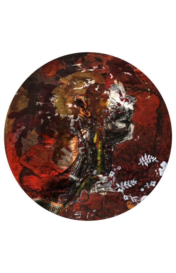
–an “in progress” pic of the same piece.–

–and yes, for you observant folks, that “red tree background” in the finished piece is used (albeit more manipulated) in the “zoey” plate of previous blog-post.  With the finishing of this, and the sucess at the zoey piece, I will sometime make a plate with this image on it, that is, once I find the plate for it.–

from time to you plate

–something like that.


Zoey’s Journey

Image


well, that didn’t take long.  finished.  actually, the plate I’ve had prepped and waiting for an image for at least 3 years.  THIS is why they’ll find me in a hoarder-house someday.  Mind you, it’ll be hoarded full of artsy-farts material waiting to be ‘podged together.

Anyways, this is a plate with a gel-medium transferred image.  The image is three images cobbled together via photoshop.


The Big 500 of 2015

medium transfer

medium transfer

paint/screenprint on epoxied panel

paint/screenprint on epoxied panel

transfer/screenprint on collage

transfer/screenprint on collage

gel medium over collage transfer

gel medium over collage transfer

paint with gel medium glitter print

paint with gel medium glitter print

Doesn’t look like much has gone on for like….a year?  Well, nope.  Stuff has gone on.  “stuff”, like, say a total of 10+ new pieces that aren’t up on the site.  That’s just silly of me.  Been really working on developing a printing-style process of creating collage using gel-medium transfer techniques.  But then I go and throw paint down, then I go and see something in it, then I have to go and chase that for a while.  Not a lot of work this year, but the process behind the work has been generous.

If you don’t know about gel medium transfers, well, there’s like a million different ways and means, and I have definitely got some opinions on the matter, but here.  This link is a pretty decent start.  I’ll have to make a tutorial sometime…

The Big 500 of 2014


Well, it’s that time again, time again for annual “BIG” show.  It’s actually called THE BIG 500 this year, as every year seems to grow about 100 more.  I’ve discussed this before (just check, look for the tags, or scroll back a ways, it’s not really that far)  –premise is this:  500 artists (it started years ago at 100; its now listed at 500, though I know it’s more like 600 actually participating) get up to 10 (8″x8″) wood panels and approx. 2 months to create whatever art they want, in whatever mediums they want.  These are then shown all together, randomly and are sold for $40 each, cash and carry.  Most of the money goes to the artist, with the remaining going partly to the gallery and partly to Oregon Food Bank.  They also ask that those coming to the show bring a can of food for the Food Bank —

It’s pretty much a win-win for everyone involved.  Artists make some money if their work sells, but even if it doesn’t, its at least been viewed by a very large audience.  The gallery makes very little when the costs are factored in (imagine the cost of all that wood that is bought and cut) but the amount of people being exposed to Peoples Gallery (as well as the 3 other galleries participating:  Mark Woolley Gallery, the Artist In Residence, or A.I.R. Gallery, and the Rotator Gallery) is well worth it.  And while the OR Food Bank doesn’t get much out of one sale, or one person showing up with a can of food, when you multiply those sales by (possibly, if all sold, though I think it’s more than half) 5000, and the opening crowd being over 200 people strong, they do pretty good.

What I enjoy about THE BIG 500 (in no particular order):

The EXPOSURE!  Your artwork gets to be seen (and bought) by HUNDREDS of people, on the FIRST day it’s up!  And because it’s during the Christmas Season, your chances of selling is good!

The PRICE!  Now, I’m a very poor person (i think i’ve got $14 in my bank account right now) but even I can (usually) afford $40 for a unique piece of art.  There’s a group of collectors who LOVE this show, because they know their favorite artists have up to 10 pieces selling dirt cheap.  It’s true, with some of these artists, its a rarity to get their art at $40.

The CHALLENGE!  I’m sure some artists can just crap out masterpieces (bully for them) but for many I know, it’s a challenge to make 10 works of art in 2 months –And that’s OK.  Challenge Accepted!!!  I  find it usually works something like this:  I immediately have ideas for about half, then when crunchtime really gets me, I come up with the rest and more to spare.   They ask that we do “good work, work that people know us by, work that sells”  —and while I don’t disagree with that, I don’t feel like I have “work that people know me by”, and since most of my stuff doesn’t sell (sad) it’s hard to stop myself from making something just because it might not sell.  What I enjoy in the challenge is that in the process I learn so much.  This year I got a lot of practical experience cutting glass, as 7 out of 10 pieces use glass.  One piece in particular I had to remake 3 times because of breaking glass (also the reason for 9 pictures rather than 10).  I also learned a few things about the epoxy I use which could definitely help out in future projects.

The VOLUNTEERING!  It gets SO CRAZY on opening day, but at the same time its SO CRAZY FUN!

The ART!!!  If you don’t look at art all year, this event will take care of all your art-looking needs.  Simple math says that there will be (at least) 5 FRICKIN THOUSAND pieces of art to look at!  You just gotta do it quick, cause by the end of the first day (my guess is that) nearly half of it will disappear.  Even if you don’t show up the first day, there will still be THOUSANDS of quality pieces to buy for the remainder of the show.

that all said–


You should Go!

The Annual BIG 500

Opening 2pm Saturday, Decemeber 13th thru January 11th

at THE PEOPLE’S ART OF PORTLAND GALLERY

in the Pioneer Place Mall, 700 SW 5th Ave, suite 4005

www.peoplesartofportland.com

Vanity B. Ramsey

vanity b ramsey 
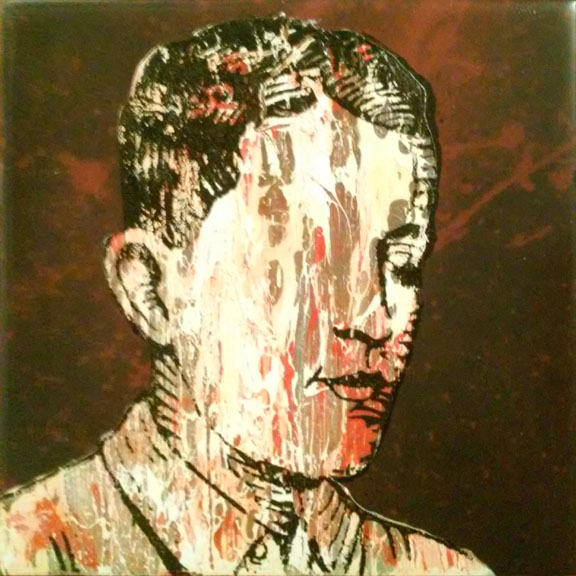
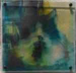
So this is something that’s been sitting around, half done, for —let’s just say 2 years.  It’s probably more than that.  At the time when  I made the image itself I was experimenting with CMYK images –how to break an image down in photoshop into the 4 channels and prepare them for eventual screenprinting.  I was also then dabbling with image transfer techniques –I also had a lot of film (transparency film for burning screens, which I had quit using since I had gone to the veg. oil and photocopy technique of making films) and a lot of glass (cuz I was framing a lot of artwork).  I had other interpretations of this image, just nothing that really worked so far.  So it was in the spirit of “lets just see what happens” that I made this verson.  There are two films sandwiched together on top of glass.  One film is the Magenta and Black channels, which depict an old (and common) image of Death, coming out of the grave.  The other film, done in the yellow and cyan, depict a common image of Jon Benet Ramsey in full child beauty queen regalia.  Those who don’t know who she is, look her up.  I’ll let you come up with your own interpretation of why the two have been combined, though I think it’s obvious.  Anyways, after putting the glass together and putting it into a frame, I put it away until just this month.  I think it was more about trying out something than coming up with a finished piece, and when i got to that point I guess I was stumped.  Without it being in a window, or some light source behind it, it was too dark.  So it got put away and forgotten about, mostly.

This coming month there is a group show that I thought this would be perfect for, so I got it back down and thought about how to make it work better.  2 weeks thinking of “how do I create a lightbox that’ll work, look decent, but still be temporary in case the viewer/owner wants to put it into a window”.  Then I said, this thinking isn’t getting me anywhere, lets just build it and figure it out as I go.  This is the result.  The light box is made up of scrap wood, a piece of semi-opaque acrylic, and a 26 ft. string of LED lights woven behind the acrylic, powered by batteries.  The LEDs run cool enough to where they won’t cause any problems with the glass or plastic films, the battery pack solves any problem I would’ve had with wiring, and is cheaper and as effective as flourescent lighting.  The simple box framing is held onto the frame by  4 screws, so it’s easy to take apart and hang without the lightbox, though now I’m a big fan of the lightbox, which had been put together in under a day.  Part of me says “why didn’t you do this sooner?”, but most of me says “Good work Larry –Good work and in due time.”


Eraser 01

Eraser 01


Just a new something that’s done (for now).  Working like a screenprinter except with no press, and no screen and no squeegee.  huh.

Got a couple more working their way down the line, for what besides the love of making i don’t know.  This piece just made me think of an oldie.

I’m not the man you wanted me to be
He’s kept alive inside your fantasy
But now the magic me is fading fast
Let me remind you of the face behind the mask

-thompson twins, “day after day”-

Are Yesterday’s Execs Keeper of Our Music Zoo?

Vinyl,Cassette,CD,Ether

Are Yesterday’s Execs Keeper of our Music Z

Is obscurity itself the test tubes of tomorrow? Or is just the testing done to pave the way of sorrow? Is the chalice set upon the table for the bride of prima donnas? Or can indeed, the world be freed by finger popping mommas? Is the confusion of immorality little more than a doubt on the face of infinity? Or does indeed immorality feed upon itself And hence hasten to speed  it’s own mortal conclusion? Is the scent of melting tin upon the tracks of time The mere excuse for letting loose the calling cards of crime? Or is this verbose verbosity that very violation? Does not the babbling brook run its way to oceans and streams Only to dry up and rain once more?   -from “the knife fight” by THE RESIDENTS off of ‘WHATEVER HAPPENED TO VILENESS FATS’

This piece comes to you by Divergent Thinking.  The question after the answer, The solution from the making.  Materials arrived at a time when issues had to be addressed and were used accordingly without hesitation, which created new issues which were then pursued.  The background, made nearly a year before the rest, are circle punchouts from a bunch of CD covers mostly 90’s rock/pop/etc., randomly placed.  Somewhere there’s a GIF file showing the placement.

The 88 STRONG SHOW –2014–

  Wherein 88 artists each create 8 pieces of art, 8″x8″ in size, incorporating one or many of 88 different “themes”.

modern/ancient

modern/ancient

Oil Fountain

Oil Fountain

paradise/flames

paradise/flames

"are Zoo animals contented in captivity?  This chimpanzee seems to be assuring the director of the Zoo that EVERYTHING IS ALL RIGHT"

“are Zoo animals contented in captivity? This chimpanzee seems to be assuring the director of the Zoo that EVERYTHING IS ALL RIGHT”

Everything Will Be Fucked

Everything Will Be Fucked

Silvervein on Pigmented Epoxy

Silvervein on Pigmented Epoxy

untitled white man

untitled white man

Everything WILL be fucked if you leave the fridge door open...

Everything WILL be fucked if you leave the fridge door open…

New Year, another try, another (happy) accident

screenprint on masonite panel

screenprint on masonite panel

Starting off the year with a Pink Siouxsie.  I think I said it on Facebook –“I haven’t been making any art lately, but I got this terrible urge to make some bootleg siouxsie sioux t-shirts, with her being REALLY BIG on ’em…”

Well, I haven’t gotten around to those shirts, but here’s this.  And I love this.  And this wouldn’t have happened if I listened to reason.

See, I had my films made for the shirt, essentially this image, but when I went to burn the screen, I found out that our screens aren’t healthy right now.  The screens have been coated & waiting to be used for months now, and our best guess is that they’ve sat too long and have gone bad.  It could be a number of things, but what it boils down to is that the screens don’t burn out properly.  I should be able to spray out the image with our good ol’ garden hose in around 3 minutes and have it –I burned two screens on separate occasions, and they only sprayed out by using our pressure washer, which is kinda like using a chainsaw to cut a piece of paper.  I lost a LOT of detail in the screen on the first one.  After telling my comrade that, “Yup, you’re right, the screens are effed up” and him agreeing, I came back the next day to try again.

Why?  If the screen isn’t going to burn properly, you’re not going to get what you’re after.  Why waste the time, the effort, the water?  –Well, there’s many reasons.  From my amateur angle, I still wasn’t 100% convinced that I couldn’t get a decent screen –maybe if i tried a different exposure time, and if that didn’t help, maybe if i gently scrubbed on the screen to get the washout started, maybe this, maybe that…

Well, that’s all a waste of time and effort if you already know it –If I had an extended history of dealing with screen failure problem-solving involving chemicals, films, exposure times, etc., maybe I’d know it was already completely hopeless, a waste of time –maybe I’d have the attitude that nothing good would come of this trying.

I already knew from the get-go that the 2nd screen wasn’t going to be perfect.  I was using this massive home-made screen I got from my friend Hill-Jacquard, so big it wouldn’t properly fit on the exposure table.  “well, that’ll probably be a problem, but so what.”  And, as predicted, the emulsion wasn’t coming out, even with some gentle scrubbing.  “eff it, lets just scrub the crap outta it.”  Then the pressure washer  –by the time I was done, it was twice as “bad” as the first screen, but as I looked at it, I was inspired.  I essentially “saw” the image you see up above.  Basically, paint a panel bright pink, then print both screens in complementary pinks over top, the distortions of the print working with each other and background.

I know some artists don’t believe in it, but I DO believe in “Happy Accidents” –sometimes those accidents don’t lead to a finished work, but they usually have the potential to at least teach me something.  I suppose when a professional screenprinter, wants an effed up print, would go thru the effort of photoshopping it effed up, then pore over the details of the effed up film and screen, to be sure it was “properly” effed up.  Like those “distress” fonts or brushes, just to make things look old, or effed up, or how my friend put it, “hipster”.  I just tried stuff, and the happy accident was that it inspired me.  Just think, if I listened to reason, and didn’t give it a try just for the hell of it, I wouldn’t have this.  I’m glad I’m hard of hearing.